Category
Creative, Design, MarketingAbout This Project
BAR SORBO
A Tiny Bar with Clear Intent
Brand Development, Visual Identity, Menu Design, Merchandise
The Concept
Bar Sorbo is a small, design-conscious bar in Valencia with a strong sense of atmosphere and an unusual but refined focus: Japanese drinks, tinned fish, and a live aquarium behind the bar. Run by a couple with a shared love for simplicity and subtle storytelling, the space invites guests into something personal, peaceful, and quietly distinctive.
Our role was to create a brand identity that reflects the bar’s aesthetic and personality — minimal, memorable, and rooted in intentional detail. From typography to print materials, everything was designed to feel precise, confident, and quietly expressive.
The Approach
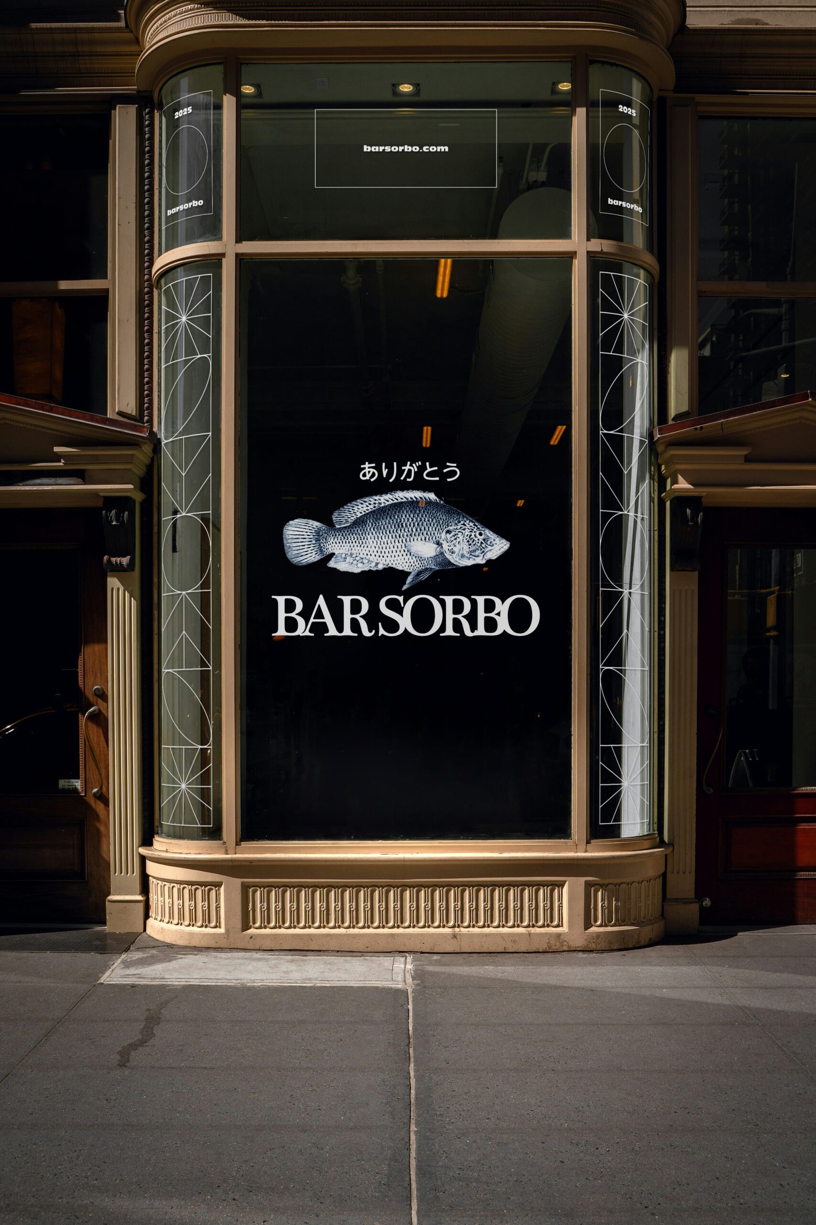
Brand Identity
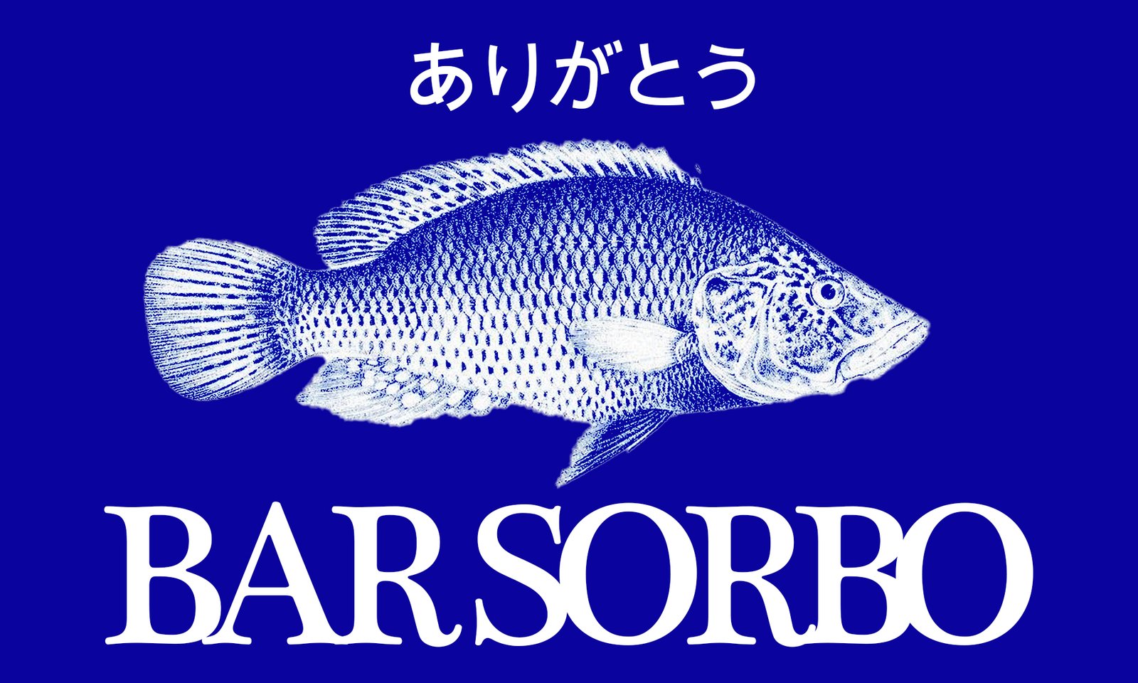
We developed a refined wordmark and a pared-back visual system. A stylised fish illustration serves as a recurring brand element — a nod to the couple’s personal connection with aquatic life and the menu’s focus on preserved fish. Japanese text is subtly integrated as a gesture of respect and visual rhythm.
- Custom serif wordmark
- Bespoke typesetting with careful spacing
- Hand-drawn fish mark
- Deep blue palette used consistently across touchpoints
- Japanese typography to echo cultural influence
Menu & Print Design
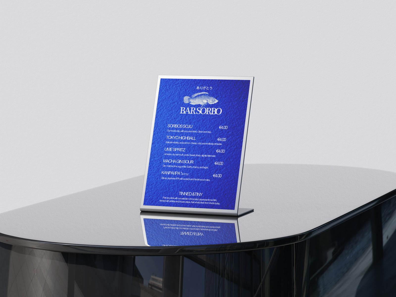
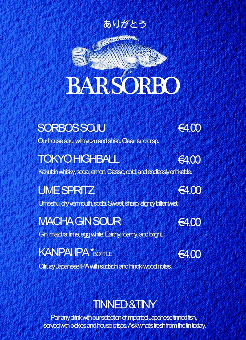
The drinks menu was designed to feel tactile and curated — something worth picking up and keeping. We paired short, stripped-back copy with strong visual hierarchy, allowing the menu to feel both functional and collectable.
- Clean grid-based layout
- Flat-rate pricing to reinforce simplicity
- Textured background and monochrome print for visual depth
- Minimalist cover layout and inner structure
Merchandise
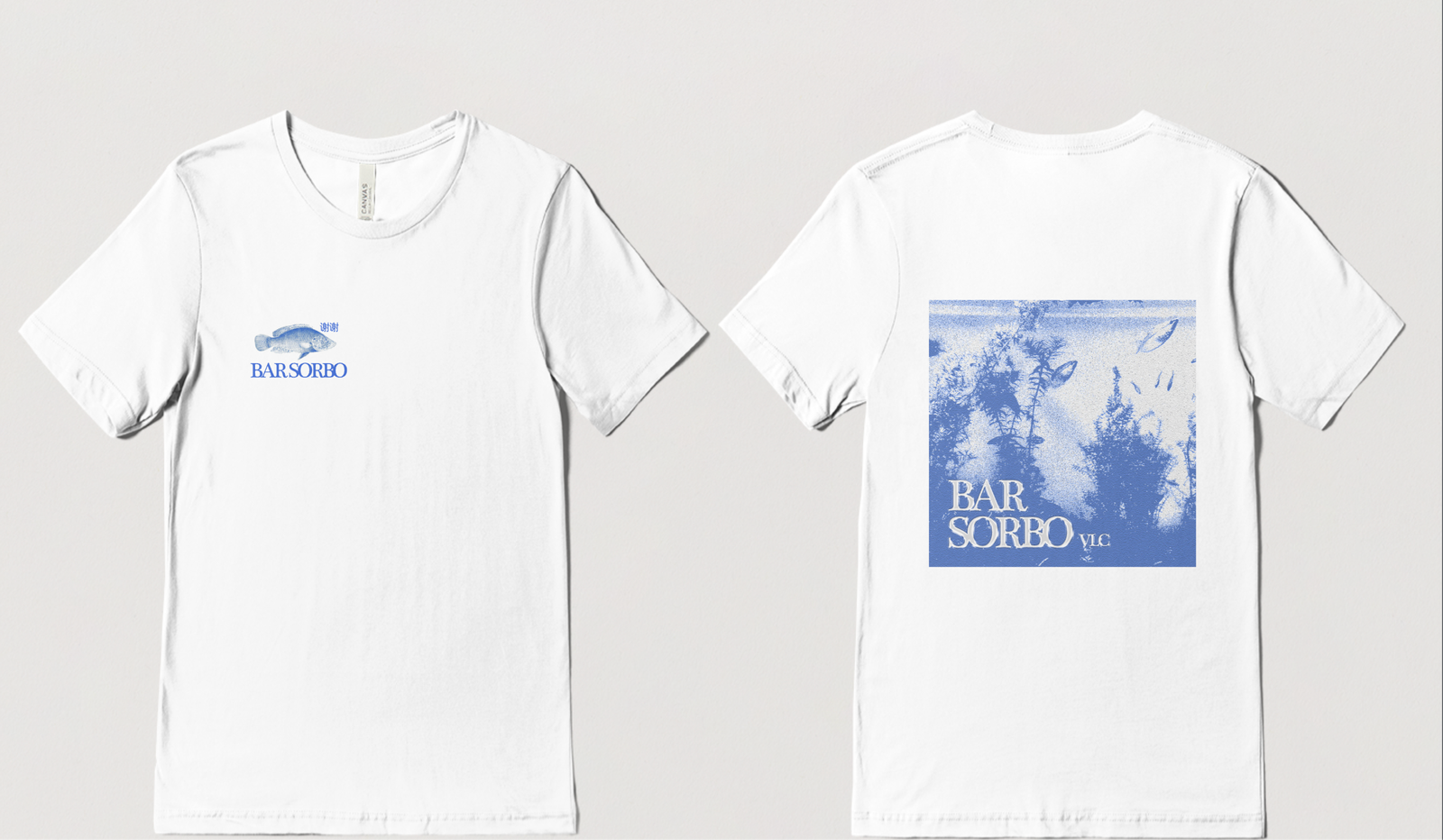
We extended the identity into a minimal merchandise collection, starting with screen-printed tees worn by staff and available for purchase behind the bar. The pieces use the logotype and fish mark on the front, with marine-inspired imagery and vertical typesetting on the back.
- Black-on-white screenprint design
- Halftone marine texture for depth
- “ありがとう” (thank you) motif to connect tone and culture
The Collaboration
Bar Sorbo was a true collaboration built on trust, taste, and shared clarity. With a focused creative direction and a minimal budget, we leaned into visual restraint and consistency. Every element — from logo to menu to merchandise — was designed to carry the same tone: quiet confidence, refined charm, and a sense of care behind every detail.
Results at a Glance
- Brand identity rooted in clarity and minimalism
- Collectable-style drink menus with visual and tactile appeal
- Distinctive merchandise aligned with the bar’s mood and values
- Visual consistency across all branded touchpoints
Services Provided
Brand Identity Design
Illustration & Iconography
Menu Layout & Print
Merch Design
Typography System
Colour Direction
This was design that lets the space speak for itself — with clarity, intention and a little imagination.

